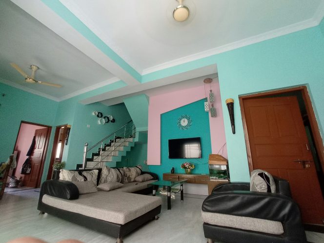
Designing a home is about more than selecting stylish furniture or the latest decor trends. Color—often underestimated—plays a powerful role in how we experience a space. Color psychology, the study of how hues influence human emotions and behavior, is a valuable tool for homeowners and designers alike. By understanding the relationship between color, mood, and spatial perception, you can create interiors that feel balanced, energizing, or soothing—exactly the way you want them.
In this guide, we’ll explore how color psychology works, examine the emotional impact of different hues, and provide actionable tips for choosing the right palette for each room in your home.
Why Color Matters in Interior Design
Color is more than a visual element; it affects us physically and psychologically.
Mood Regulation: Colors can raise or lower energy levels. Bright yellows can uplift, while cool blues may calm.
Spatial Perception: Lighter tones make a small room feel bigger, while dark tones create intimacy.
Cohesion: A consistent palette across rooms makes your home feel harmonious.
These effects are supported by research in environmental psychology, which shows that our surroundings directly influence stress levels, productivity, and overall well-being.
Understanding the Color Wheel
Before selecting colors, familiarize yourself with the color wheel:
Primary Colors: Red, blue, yellow.
Secondary Colors: Green, orange, purple—made by mixing primaries.
Tertiary Colors: Variations achieved by combining primary and secondary hues.
Knowing the relationships—complementary (opposite on the wheel), analogous (next to each other), and triadic (three evenly spaced)—helps create visually appealing schemes.

Warm vs. Cool Colors: Setting the Tone
Warm Colors: Reds, oranges, yellows. They evoke warmth, excitement, and coziness—great for social spaces like living rooms and dining areas.
Cool Colors: Blues, greens, purples. They promote calm and focus, ideal for bedrooms, bathrooms, or offices.
Balancing warm and cool shades across your home prevents monotony and ensures each room’s atmosphere fits its purpose.
The Psychology of Popular Colors
1. Blue: Calm and Focused

Blue is associated with tranquility and reliability.
Best for: Bedrooms, home offices, bathrooms.
Tip: Pair light blue walls with white trim for a crisp, airy feel.
2. Green: Balance and Renewal

Green represents nature, growth, and balance.
Best for: Living rooms, kitchens, reading nooks.
Tip: Olive or sage green adds sophistication; emerald makes a bold statement.
3. Yellow: Happiness and Energy

Yellow brings optimism and light.
Best for: Kitchens, breakfast areas, small entryways.
Tip: Use softer buttery tones to avoid overwhelming brightness.
4. Red: Passion and Vitality

Red stimulates conversation and appetite.
Best for: Dining rooms or accent walls.
Tip: A single red accent wall creates drama without feeling oppressive.
5. Neutrals: Timeless and Versatile

Whites, beiges, and grays provide a clean backdrop.
Best for: Any space.
Tip: Layer textures—linen curtains, wool rugs—to prevent a sterile look.
How Lighting Changes Perception
The same paint can look entirely different depending on light:
Natural Light: North-facing rooms have cooler light; south-facing rooms feel warmer.
Artificial Light: LED, incandescent, and fluorescent bulbs all cast unique tints.
Always test paint samples at different times of day to see how the color behaves.
Choosing Colors Room by Room
Living Room
Goal: Warmth and social connection.
Recommended Palette: Soft neutrals with warm accents (burnt orange cushions, mustard throws).
Kitchen
Goal: Cleanliness and appetite stimulation.
Recommended Palette: Whites or light grays with splashes of yellow or green.
Bedroom
Goal: Relaxation and rest.
Recommended Palette: Cool blues, gentle greens, or muted purples.
Home Office
Goal: Focus and creativity.
Recommended Palette: Soft greens or blues with a pop of energizing color like coral.
Practical Tips for Selecting the Perfect Shade
Create a Mood Board: Collect fabric swatches, photos, and paint chips to visualize combinations.
Use the 60-30-10 Rule: 60% dominant color, 30% secondary, 10% accent.
Consider Adjacent Rooms: Maintain a cohesive flow by sharing undertones between spaces.
Test Before You Commit: Paint sample patches on multiple walls to observe changes in different lighting.
Trend Forecast: Colors for 2025 and Beyond
Industry leaders predict a surge in nature-inspired hues—think earthy terracotta, oceanic blues, and mossy greens. These shades reflect a growing desire for sustainability and comfort in uncertain times.
Integrating Texture and Pattern
Color alone can feel flat. Add dimension with:
Textured Walls: Limewash or plaster for depth.
Patterned Fabrics: Rugs or cushions that introduce secondary colors.
Metallic Accents: Brass or copper fixtures to reflect light.
Conclusion
Harnessing color psychology for home interiors isn’t about following strict rules—it’s about understanding how hues influence emotions and space. By considering lighting, room function, and personal preference, you can create a home that feels uniquely yours while supporting the moods and activities of daily life.


